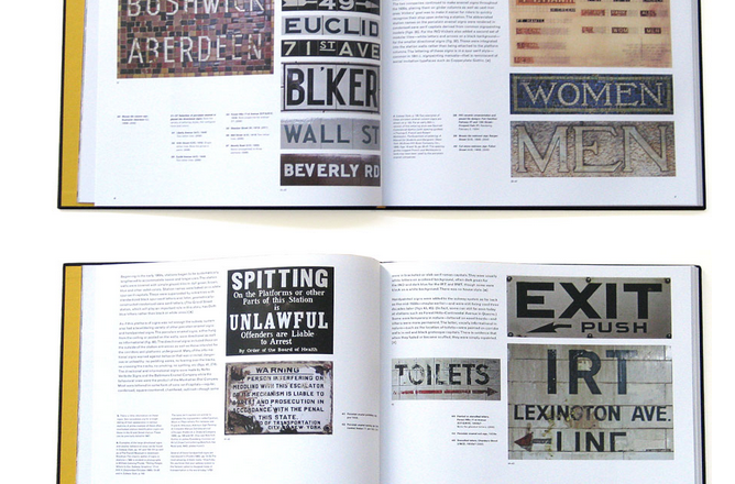
For decades the New York City subway system was a visual jungle of confusing and often redundant signs in mosaic, terracotta, cut stone, porcelain enamel, wood and paint. This began to change in 1966 when Unimark International was hired to instill order and clarity to the system. What happened in the four decades since is the story of this book.
http://www.helveticasubway.com/images.php
Helvetica and the New York City Subway System
