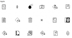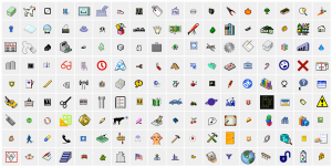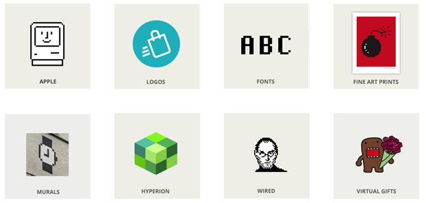

Since 1983, Kare has designed thousands of icons for the world’s leading companies. Utilizing a minimalist grid of pixels and constructed with mosaic-like precision, her icons communicate their function immediately and memorably, with wit and style.”
She began her career at Apple, Inc. as the screen graphics and digital font designer for the original Macintosh computer, initially advertised as “the computer for the rest of us.” Her studio’s work continues to optimize for clarity and simplicity–whether for icons, corporate identities, web design, or murals–and to present concepts in clear, concise, and memorable ways.
Kare believes that good icons should be more like traffic signs than illustrations; easily comprehensible and not laden with extraneous detail. She has observed that just because millions of colors are available, maximizing their use in an icon does not necessarily improve it. When symbols (icons or logos) are meaningful and well-crafted, they need not be frequently redesigned.
