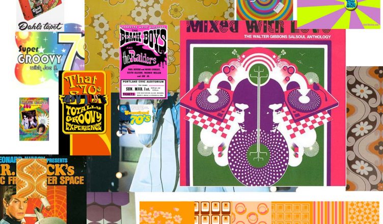
It also develops a communication platform between you and your client so they have the opportunity for either early ‘buy-in’ to your proposal or to raise any concerns they may have.
How many times have you put forward a design to hear the fateful words:
‘I don’t like [insert colour/typeface/shape here]’
You can cover any of these issues (and more) in your mood board and have your client agree the route to follow, before you even open Illustrator.”
…
Andy: “One of the things that interested me was when Mr. LLB asked his client to make a mood-board containing cuttings from magazines, photographs and fabric samples to give him an idea of what they liked and didn’t.”
…
Kate: “I used to work in a large game design company, and the boards they’d come up with were pretty damn amazing, so when I had to come up with something for a miniatures painter, I kept on throwing images at her as the sort of mood and style she wanted. And it was a great way to explain things to people without getting techie.”
…
Tim: “We’ve also taken a selection of mood boards to a client to act as a catalyst to get things going (collections of photos from stock libraries). We also give them a selection of websites to choose hot and cold ‘aspects’ from (so that when they say they like a website, we know they mean ‘we like the glowing red button’ not the loveley pastel colours).
…
Clint: “I think they’re especially useful when designing for an audience that you are not entirely familiar with. For example, we did a project around furniture for teenagers. To prep, we all created mood boards to help get into the mindset of teenagers and get a feel for what appeals to them. It was helpful for establishing a look or feel that might be outside of your normal design thinking.”
…
Sander: “It really helps to communicate suggestions of branding or layout/shapes as part of a creation process and as a method of elimination.”
…
Marcus: “Does anyone have any suggestions as to the best way of putting them together — should they have any sort of structure or zoning, or should everything be random? My right-brained mind wants to organise things — perhaps with horizontal and vertical axes, colour on the horizontal, mood or something along the vertical?”
..
Tom: “It’s good if you looking for idea’s or inspiration. For example, a client wanted a Japanese feel so i’ve been looking on flickr for idea, reading blogs and magazines. I now have this “mood board” in photoshop that I can draw upton for ideas.”
Gevonden op: http://www.stuffandnonsense.co.uk/archives/design_mood-boards.html
