http://www.twopoints.net/portfolio_page/bacoa/
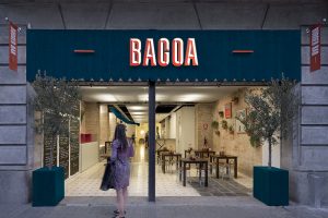
http://www.twopoints.net/portfolio_page/bacoa-interior-design/
“Two key values: 1. Handmade. They try to prepare as much as they can themselves and the recipes for burgers and sauces are their own inventions.
2. Local (Spanish). Most of their recipes are inspired by spanish dishes or use traditional spanish ingredients.
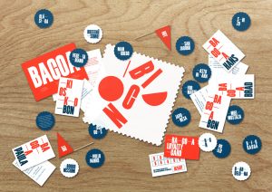
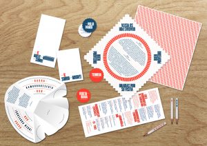
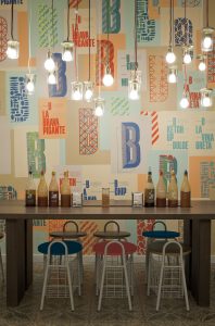
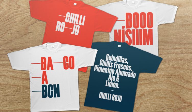
One of the biggest influences were the typical spanish bars from Barcelona. Usually they were build in the seventies. They often use condensed sans-serif typefaces, cut out of acrylic glass. The color scheme of these bars is very limited. Usually the boards, napkins and doilies are only printed in two colors, red and blue. We also tried to embrace the sometimes amateurish design, which gives a typical spanish bar it’s own charme.
Inspired by the vernacular type found at bars in Barcelona, we drew a typeface, the TpBarPaco. Jacques Le Baily programmed the open type features of the typeface and generate a web font. We used Times Lt Std for smaller sized or bigger amounts of text. Bacoa is expanding. Since 2013 Bacoa is a franchise. One of the needs of the visual identity was to be able to create sub-brands for different cities.
Color Scheme
The color scheme for Bacoa was inspired by the colors used in a typical spanish bar, but we gave the red and blue a warmer twist, made them look more “summerish”. It was important to use a lot of white on all the applications.
Bermellón
Pantone 171
R255G92B62
HTML FF5C3E
Azul Verano
Pantone 308
R0G91B130
HTML 0075B0
We played with the visual expression of the pronounciation of words, like for example “SO GOOOOOD”. We used this way of spelling on t-shirts and napkins.”
