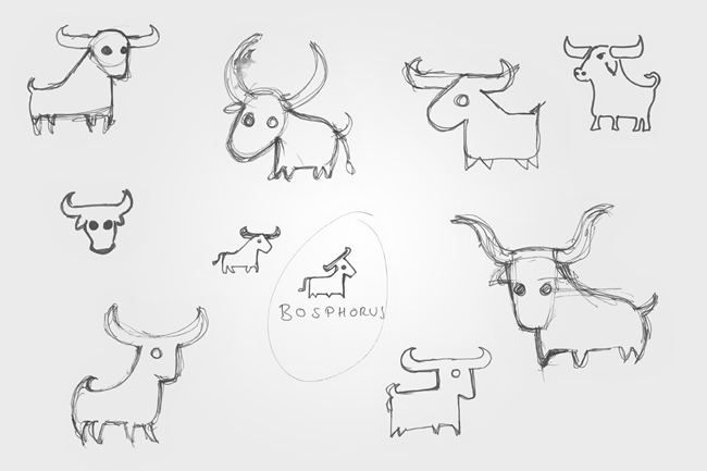
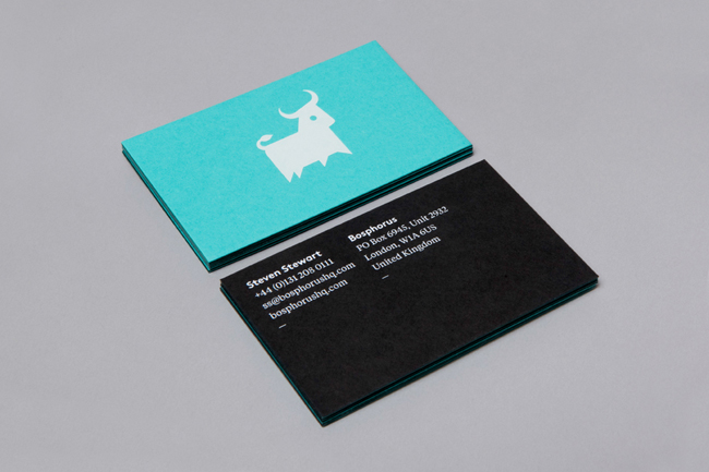
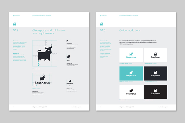
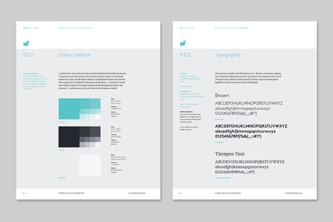
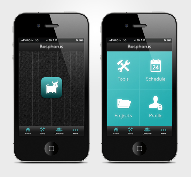
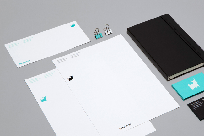
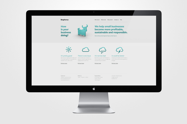
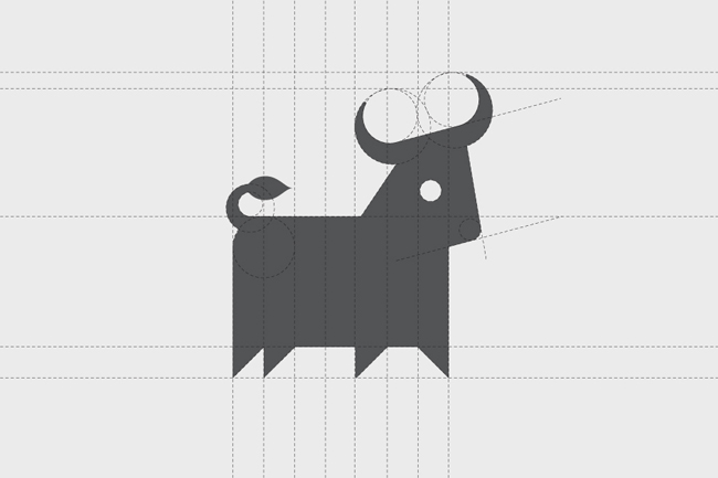
If you’re not as keen on a more adventurous approach as the previous example, a more formulaic layout of a manual can work just as well. This manual by Mike Collinge for Bosphorus lays out each page similarly with a cohesive format that makes digesting the information easy and clear. As always, consider your brand and whether or not a more minimal approach would suit it/the guidelines better. Have a look at Bosphorus’ approach over here.
