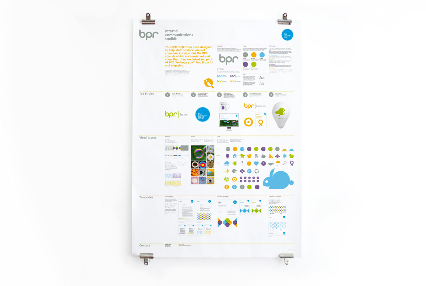
Don’t be afraid to get a little experimental with your style guide’s design. This guide for BPR has been executed as a poster. Why? Because it concerns BPR’s internal communications, so using the format makes in-office reference to the rules as easy as a glance over toward a poster. Do consider your own situation though, and what medium would be best for your brand/whoever will be reading your guidelines – a designer doesn’t want to open an A2 poster while at their studio desk just to find which size type to use. But for this instance, a poster is a useful medium. Have a closer look at the poster and well-organised rules via Red Stone.

