Why Your Annual Report Should Be a Piece of Master Storytelling
The annual report is a once-a-year piece of content that’s mandatory for many organizations and a powerful tool for many more. While it can be tedious to assemble, it’s incredibly important. This single piece of communication presents a wealth of information about your organization to many different audiences. How those readers engage with that content affects their perceptions of your business in significant ways.
If your annual report is simply slapped together as a statement of facts, you are losing a huge opportunity to bolster your brand.
Narrative anchor
Some brands build their reports around a theme, initiative, or goal. This can create a great through line, from your case studies to your stats. Read more

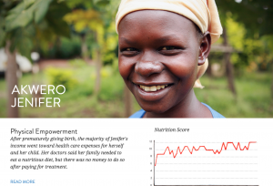
Example: Krochet Kids intl. is a non-profit apparel company that empowers those struggling with poverty in Uganda and Peru by teaching them to craft handmade goods. This mission was highlighted throughout the report.We turned the 2013 annual report for Krochet Kids intl. into an interactive infographic, allowing viewers to explore and engage with the story, which also included video and interactive data visualization.
Human stories
Whether it’s a spotlight on your employee initiatives or customer success, humanizing these stories by putting a literal face to them greatly increases your reader’s emotional response.
Example: The Krochet Kids intl. report included photos and backstory of the people they work with.
Design elements
Design is always meant to enhance storytelling. It can also reflect the story of what your company does.
Example: As Krochet Kids intl. is an apparel company, we used thread art as a visual storytelling tool.
Data
Make sure your data visualizations are clear and understandable. You can also expand your story by providing comparative insight or additional data sets from previous years.
Example: The data visualization included in the Krochet Kids intl. report allowed viewers to explore various data points and see them change month-by-month.
12 Visual Content Lessons From Warby Parker’s Annual Report
Voorbeelden
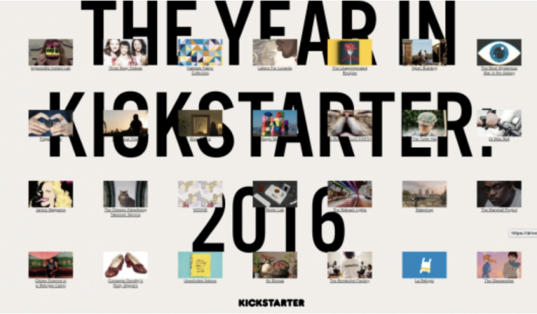
Interactieve jaarverslag kickstarter
https://www.kickstarter.com/year/2016
https://www.columnfivemedia.com/best-examples-of-beautiful-annual-report-design
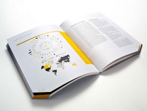
AEGIS 2016 Annual Review by SVP Partners
This annual report design features modular design, strong typography, and beautiful data visualizations that make it a joy to flip through. https://www.aegislink.com/content/dam/aegislink/about_us/public/annual_reports/2016%20AEGIS%20Annual%20Report.pdf
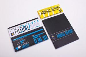
Human Rights Campaign 2012 Annual Report by Column Five
This annual report design includes unique packaging and bold data visualization that effectively communicates the organization’s story.
https://assets2.hrc.org/files/assets/resources/HRC-AnnualReport2012-web.pdf?_ga=2.73190615.596349285.1539981043-2035587966.1539981043

Clear Media Limited 2014 Annual Report by Phoenix Communications Limited
This gorgeous annual report used laser-cut technology to carve intricate scenes on each page. When closed, the layers combine to create a colorful overview for the readers.
https://www.red-dot.org/project/clear-media-limited-annual-report-2014-12610/
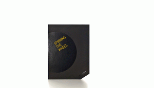
Pirelli 2013 Annual Report by Cacao Design
This is what happens when you turn a report into art. The sculptural presentation is inspired by the theme (spinning the wheel). The brilliant design of the seemingly off-balance position makes it feel as if the reports are actually rolling.
https://www.behance.net/gallery/19473333/Pirelli-2013-Annual-Report
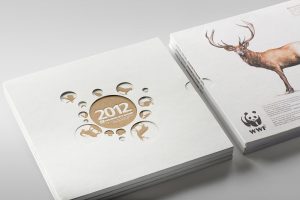
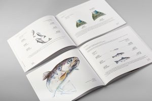
Prometey Bank 2012 Annual Report by Backbone Branding
The beautifully drawn animals featured in the pages of this annual report remind readers about the threat of extinction. It also includes some clever data visualization by using animal lifecycles to represent statistical numbers.
https://www.behance.net/gallery/18918453/Prometey-Bank-Annual-Report-2012