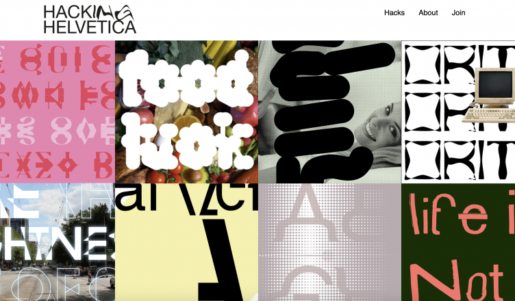
You have propably already heard of the hacks 3d-designers gave to some of the products of a big store brand from Sweden. I loved their idea: to give a common basic a twist and a swing, and turn it into something new. In the world of graphic design I was reconizing a simular thing designers were doing with typography. More and more they seem to forget boring rules of readability and function, and just ‘fuck’ with type. It personally think graphic designers don’t really have to study intensely calligraphy first, to make their own type. Small, weird changes to a basic can make a big gesture in a design. Let’s do the same with the famous, neutral and basic evergreen, the Helvetica font.
This site wants to give a stage to all these hacks. Are you joining?
