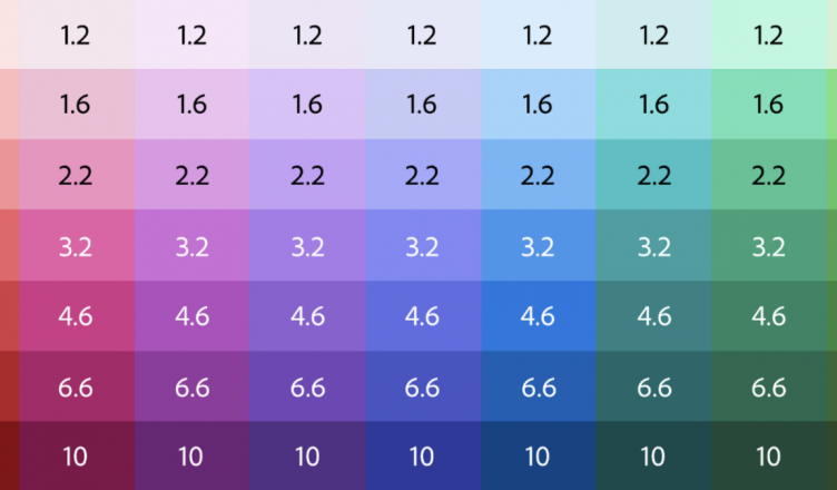
We don’t need to tell you that accessibility is important for a Design System, right? Luckily one of the most important aspects of accessibility, color, has gotten a little easier to tackle. Nate Baldwin explains how to create contrast-based themes using Adobe’s Leonardo. Not comfortable with Leonardo? You could also try https://palx.jxnblk.com/ (very simple) or colorbox.io (bit more complex), both help with creating accessible color-systems. Or you can just use AI to generate a color palette for you: http://khroma.co/generator/
https://uxdesign.cc/creating-contrast-based-themes-with-leonardo-32b6219a090f